Podcast Thumbnail Development
True crime podcasts are very common and in order to make audiences attracted to our true crime podcast, we need to make the thumbnail of our podcast as interesting as possible and make sure that it stands out from other true crime podcasts.
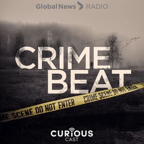
Here are a few true crime podcast thumbnails:
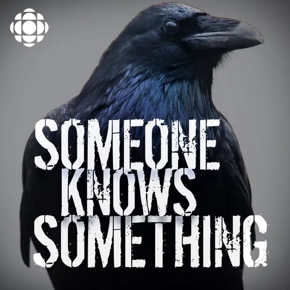
Unlike other crime podcasts, the thumbnail of "Someone Knows Something" is not very straight forward but the crow connotes death and the title of the podcast radiates a mystery feeling to it which makes the audience want to know more.
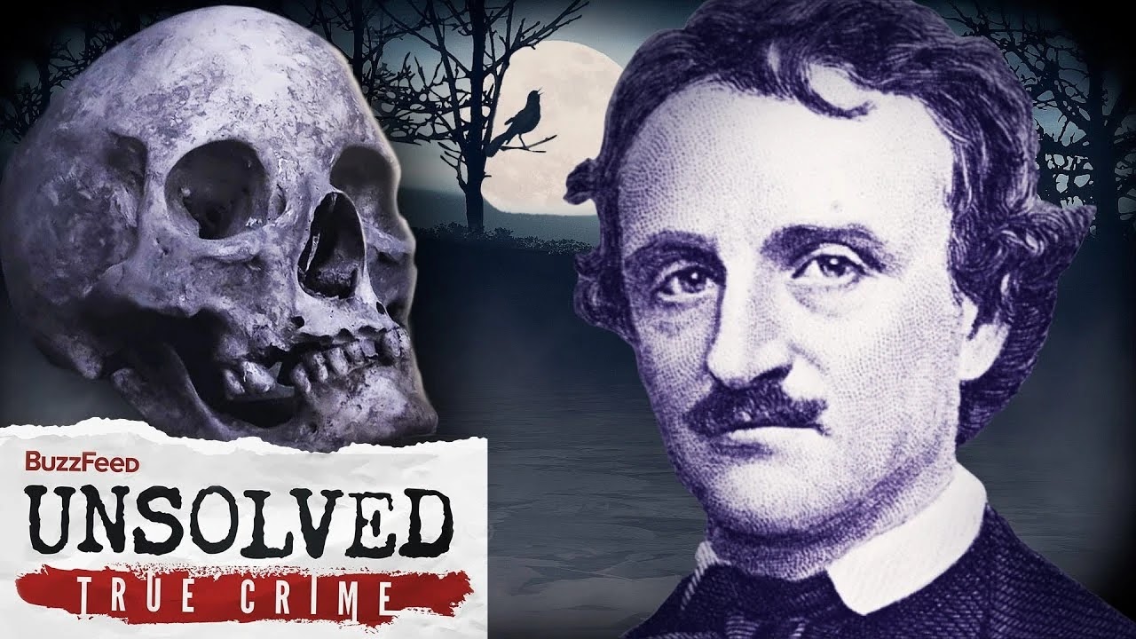
Here are a few thumbnails for true unsolved crime videos from Buzzfeed Unsolved
All of their thumbnails has the main character of the story as the central image and I like this because it is very straight forward on telling audiences who the story is about.
All of the fonts I used are from https://www.dafont.com/. I tried out 3 different sans serif and serif fonts for the unsolved logo. I tried out Adventuro Regular, MADE Avenue and Romelio Sans Regular. At the end I chose MADE Avenue because it looks versatile and classic. I enlarged the 'U' and 'D' and also made distort them into a curved shape to make the logo not look boring. I took inspirations from "You Must Remember Manson" podcast cover.
All of their thumbnails has the main character of the story as the central image and I like this because it is very straight forward on telling audiences who the story is about.
I also looked at a few true crime movie posters:
Books
This book research was made my my teammate Erina.
I did a quick google search on true crime books and found that similar to the podcasts the covers have a limited color with desaturated hues. The only color that's bright is the color red to signify blood or danger.
DEVELOPMENT
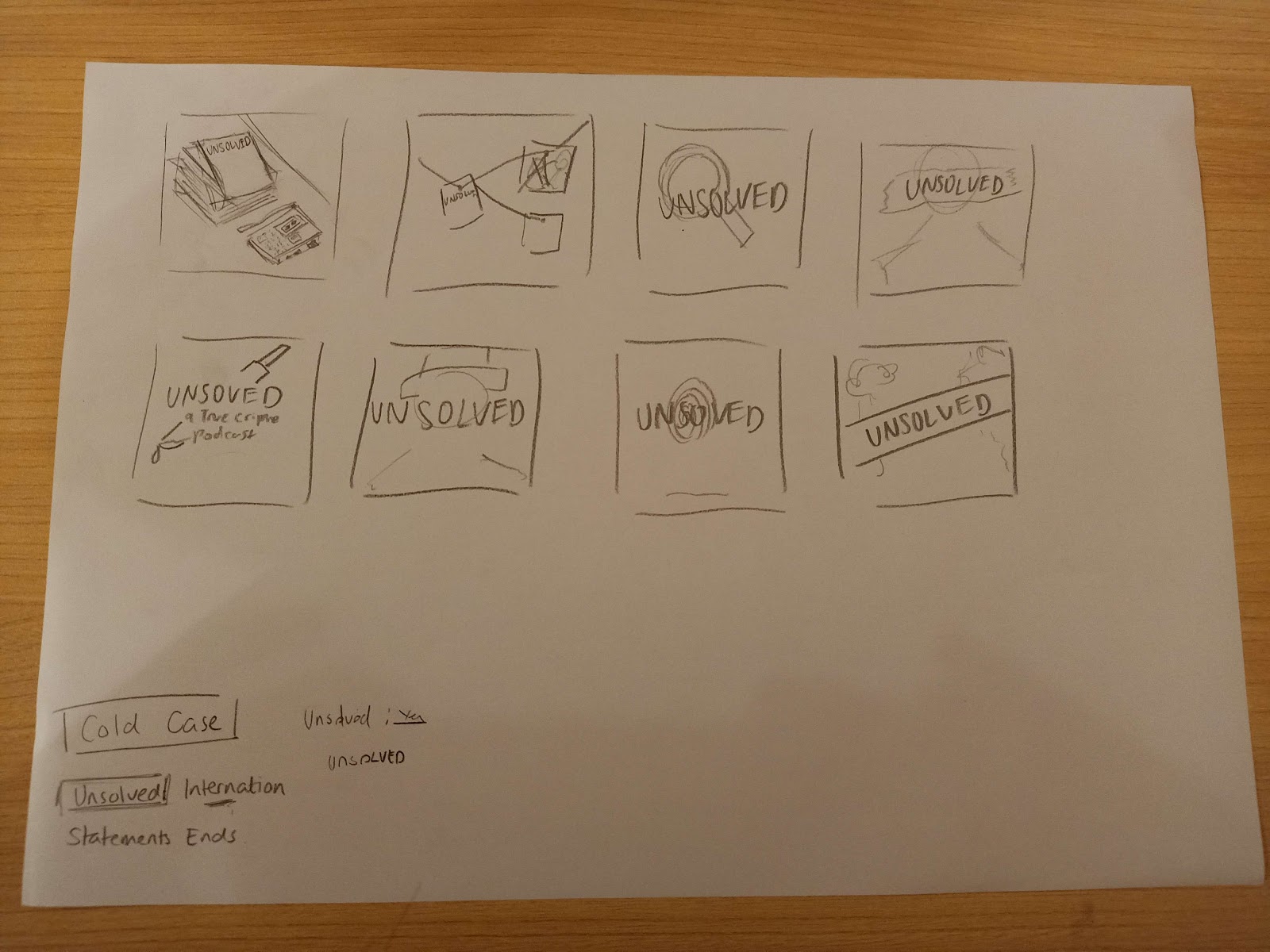
Erina's Thumbnail Sketches
Kanna's Thumbnail Development
For the background I combined 3 pictures of black roses (which connotes death), The Black Dahlia and illustration of Jack the Ripper together. I then blend the collage with a dark reddish color and added noise to create an old school feel. However I later changed the background into a dark blue color to create a contrast between the background and the logo.
For the name of the production house I tested several fonts and after several discussions with my teammates we agreed that the font LEMON MILK (the first picture) looks the best because of its simplicity.
After creating the background and deciding on fonts the cover looked too plain and unappealing so I added an image of blood splatter and red strings (as a referent from police suspect boards).
This is our final podcast cover art:
After receiving feedbacks from Mr Nick I tried to follow his suggestions of trying to change the text to white and make the "Regents Production" a little bigger. However after discussing with my teammates, we decided to use the original cover.










Comments
Post a Comment